Image 1 of 1: ‘Blank plot, before adding any mapping aesthetics to ggplot().’
Figure 2
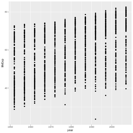
Image 1 of 1: ‘Plotting area with axes for a scatter plot of life expectancy vs GDP, with no data points visible.’
Figure 3
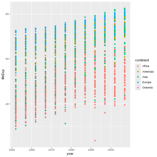
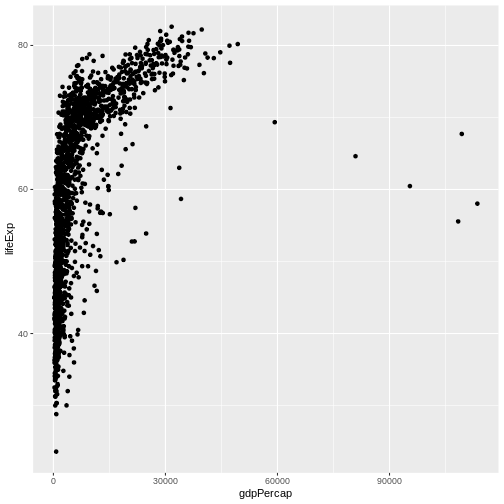
Image 1 of 1: ‘Scatter plot of life expectancy vs GDP per capita, now showing the data points.’
Figure 4
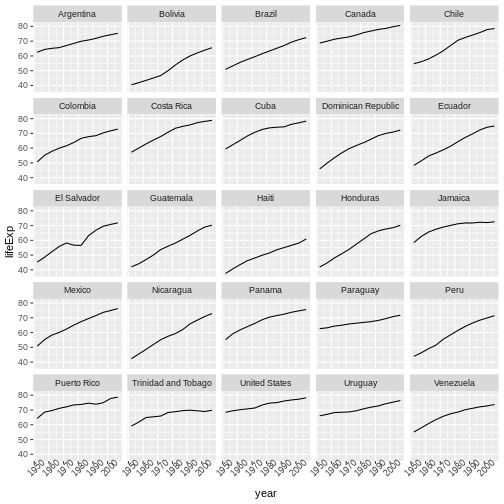
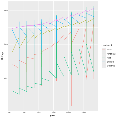
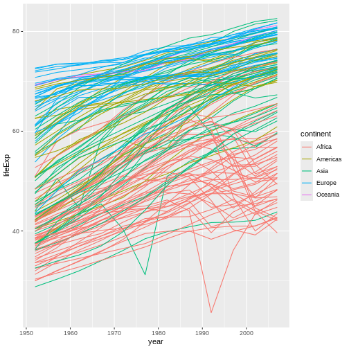
Image 1 of 1: ‘Binned scatterplot of life expectancy versus year showing how life expectancy has increased over time’
Binned scatterplot of life expectancy versus year showing how life
expectancy has increased over time
Figure 5
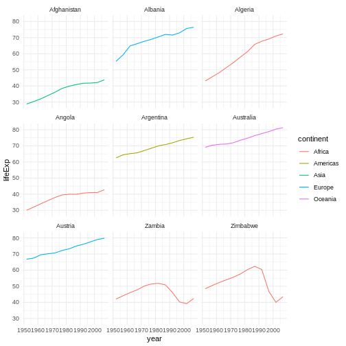
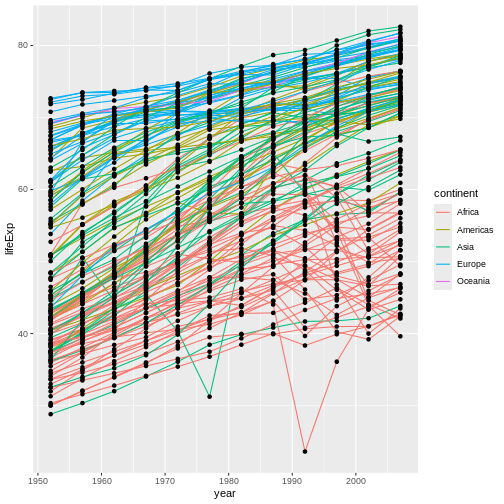
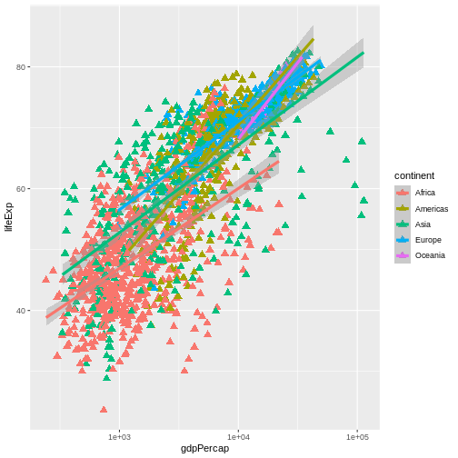
Image 1 of 1: ‘Binned scatterplot of life expectancy vs year with color-coded continents showing value of 'aes' function’
Binned scatterplot of life expectancy vs year with color-coded
continents showing value of ‘aes’ function
Figure 6
Image 1 of 1: ‘[decorative]’
Figure 7
Image 1 of 1: ‘[decorative]’
Figure 8
Image 1 of 1: ‘[decorative]’
Figure 9
Image 1 of 1: ‘[decorative]’
Figure 10
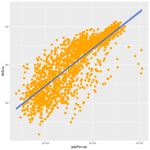
Image 1 of 1: ‘Scatter plot of life expectancy vs GDP per capita with a trend line summarising the relationship between variables. The plot illustrates the possibilities for styling visualisations in ggplot2 with data points enlarged, coloured orange, and displayed without transparency.’
Figure 11
Image 1 of 1: ‘[decorative]’
Figure 12
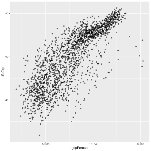
Image 1 of 1: ‘Scatterplot of GDP vs life expectancy showing logarithmic x-axis data spread’
Scatterplot of GDP vs life expectancy showing logarithmic x-axis data
spread
Figure 13
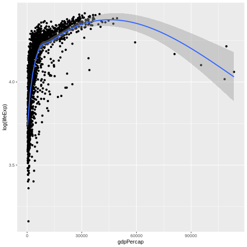
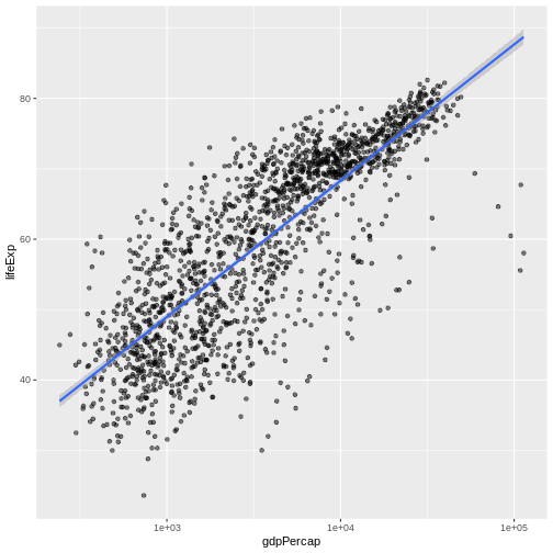
Image 1 of 1: ‘Scatter plot of life expectancy vs GDP per capita with a blue trend line summarising the relationship between variables, and gray shaded area indicating 95% confidence intervals for that trend line.’
Figure 14
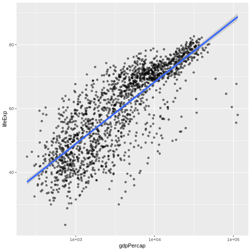
Image 1 of 1: ‘Scatter plot of life expectancy vs GDP per capita with a trend line summarising the relationship between variables. The blue trend line is slightly thicker than in the previous figure.’
Figure 15
Image 1 of 1: ‘Scatter plot of life expectancy vs GDP per capita with a trend line summarising the relationship between variables. The plot illustrates the possibilities for styling visualisations in ggplot2 with data points enlarged, coloured orange, and displayed without transparency.’
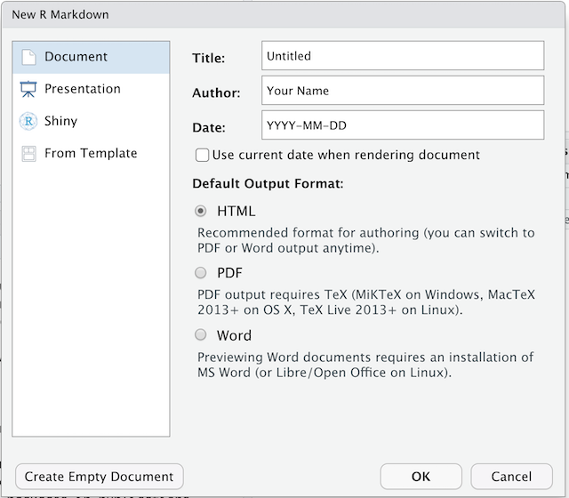
Image 1 of 1: ‘Screenshot of the New R Markdown file dialogue box in RStudio’
Figure 2
Image 1 of 1: ‘[decorative]’
Figure 3
Image 1 of 1: ‘Icon for turning on and off the visual editing mode in RStudio, which looks like a pair of compasses’
RStudio versions 1.4 and later include visual markdown editing mode.
In visual editing mode, markdown expressions (like
**bold words**) are transformed to the formatted appearance
(bold words) as you type. This mode also includes a
toolbar at the top with basic formatting buttons, similar to what you
might see in common word processing software programs. You can turn
visual editing on and off by pressing the
button in the top right corner of your R Markdown document.


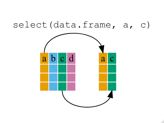 If we want to remove one column only from the